I have done some test prints in a variety of colors and styles with the local photo shop called North Coast Photo. I have tried a few online places that do photo prints and also do large stuff inkjet style, notably Photique and mPix. I had mixed results. Photique’s color correction was off, and mPix did better with colors but some of my photos had problems and one was even physically damaged. I love many of the prints, and was really energized to do more, but it was disappointing to wait a week or more only to have a print I couldn’t mat and frame.
They are old school. Even their ordering software and website have a distinctly Y2K flair to them
Since both places did a great job of my black and white prints, I thought the color issues might be me. I decided to calibrate my monitor and start checking my files for gamut. I sent some calibrated, in-gamut shots of lizards and neighbor kitties and other throwaways to each house for a second round. I still got different results from each, so I decided to see if there was another place to try, not at the top of the duck duck go or various blogs that all only refer you to whoever gives them the affiliate kickbacks. That’s when I discovered North Coast Photo.
This place is barely two miles from my house and has been in Carlsbad for decades. They are old school. Even their ordering software and website have a distinctly Y2K flair to them, neither having been updated in the last 15 years. They do film developing as well as prints, but they aren’t one of these all in one inket printing places that’ll spray your image on a piece of aluminum. They only make an old-fashioned wet process prints and enlargements. Inkjet has many advantages, and most of the online places print on everything because that’s the business model that supports them. But for North Coast Photo, well, that’s not their bag.
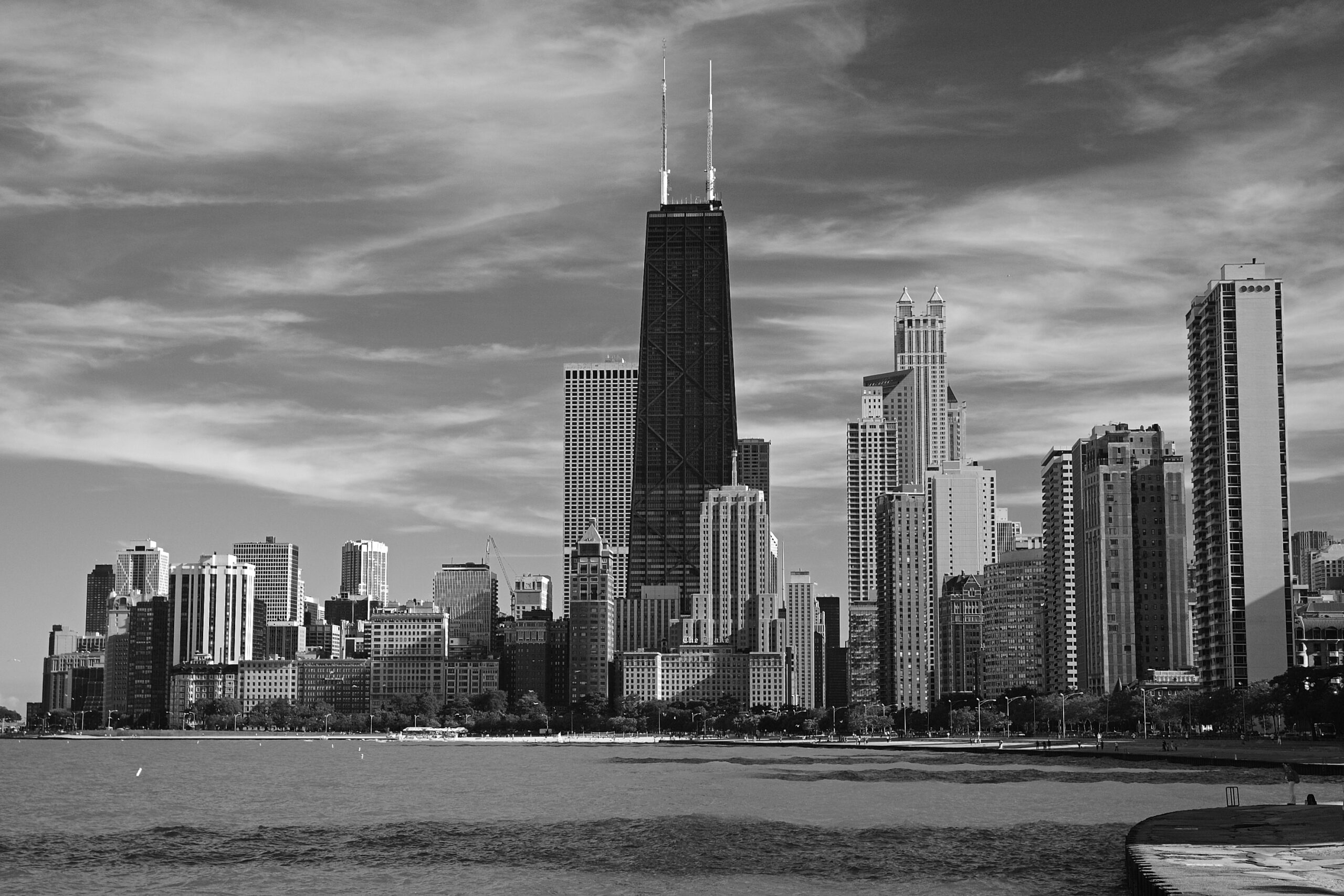
The prints I got from the online places were also silver halide — mostly, as I did try the glicee from mPix — so apples to apples. The one difference being that they came on Kodak Endura paper for color and North Coast uses Fuji Crystal Archive. Photique, especially, offers the entire range of Kodak papers, from glossy, to deep matte, and specialty metallic, lustre, and silk textures. None of which I really like, except in the case of Endura matte in black and white looking fantastic for my Chicago cityscape.

The local place is not as versatile, obviously. And they’re not cheaper, in fact they’re a couple dollars more than the online places, even when paying the upcharge for giclee at mPix, which theoretically has better color gamut and longevity.1
But, they’re local. No shipping charge. I can talk to them in person, I’ve actually seen the owner around the Village for years, never realizing this is what that logo on the side of his truck meant. Carlsbad as a whole is a reasonably big city, but the Village, up until four or five years ago when the “fuck locals” attitude of the council and resultant tourist deluge destroyed its character, has always been a pretty small town. The sort of place where I had my own meal off menu at restaurants and would run into people I knew any time I walked down the street or stopped in for a cup of coffee. You get pretty embedded in that kind of community, and recognize one another even if you haven’t met. It’s really nice to be able to get advice if I need it but even more, it’s nice to support a local business. Too many of those have failed this year.
So, for my first test, I sent three images. The first was chosen because I took it the very day I talked to them. I was quite excited with that capture, and wanted to see it in the reals. The other two I just grabbed off of my NAS, and I chose these because they were taken at Terramar, which is walking distance from the lab.


They were done perfectly. Better than perfectly, the waves in the surfer shot are more vibrant than the monitor and the palm fronds in the Palmhenge shot are absolutely tack sharp. I couldn’t believe how good the looked.
The point is, to know this they must have actually looked at the pictures.
None are actually out of gamut, the Palmhenge shot being completely unedited — straight out of the camera, and the soft proof showed no clipping when I bounced it to jpeg — and the jetty shot edited to bring the sky into range, but the surfer shot has difficult light and very subtle details on the waives, and all three are quite close to the edge of sRGB and have more difficult contrast than the shots I sent to mPix and Printique. Yet the results were exactly, precisely, amazingly correct.
But here’s the real selling point. When I went in to pick them up the next afternoon the gentleman helping me had trouble locating the envelope. He asked someone in the back and that person called out “Sunset and surfer?” I said yes and he said “Great pictures” then a girl working a different machine said “I loved the surfer photo!”
This all seems like it is just retail employees blowing smoke up a client’s skirts, but that’s not the point. The point is, to know this they must have actually looked at the pictures. With the damaged photos from one place, and the colors wrong from the other, there’s no way they did the color matching and quality check they advertised. These had perfect contrast, vibrant color, and it was obvious that these people at North Coast had provided the personal services they claimed.
So I sent in a second batch, with the olio of colors. I wanted lots of variety to test my monitor calibration, but also including He’s Big on the Inside, which I had in my test prints from both Printique and mPix. That way I could do a direct comparison. Here are the pictures I printed in batch two.


As with the first order, they are perfect. Bootsy and the green of the truck are the same on screen as in the print, way better than Printique and as good as or better than mPix. I am very impressed, and now I know how well my monitor is calibrated and am confident of what they’ll look like when printed. I feel remarkably lucky to have a service like this only a couple miles from home. I’m going to have to expose a couple rolls of 120 some day and let them do some real, old fashioned work.
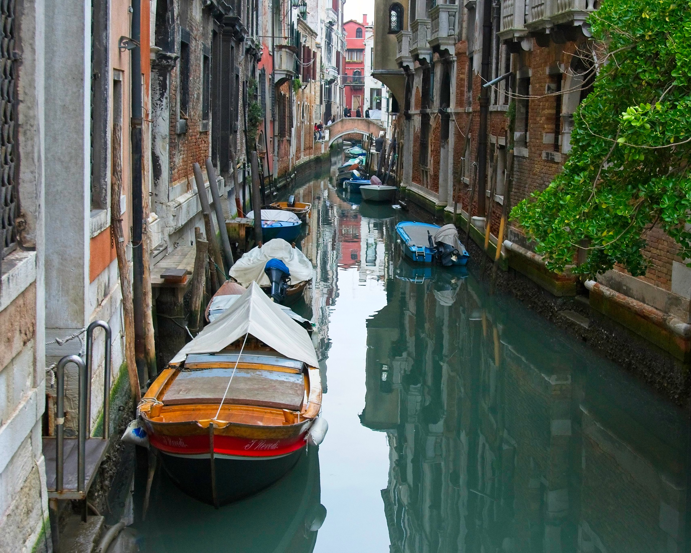
One of the images was taken in Venice, and several people have asked about it. Not my favorite image, but I thought I’d share here. First, this is the canal picture in question, cropped 5/4 and printed as an 8×10 color glossy picture.2 The picture is fine, but print itself is glorious. Even after 800 words of rambling praise, I cannot emphasize enough that North Coast Photo’s work is absolutely amazeballs.

Thing is, though it’s not my favorite photo, I am not a good judge of which of my photos are actually good. I didn’t like the surfer shot from the first test trio when I took it, but when I show people a batch of 8x10s it draws as much praise as any of the others. People connect with it for some reason.
That, I understand. It’s the root of why I can’t always enjoy good shots, and like ones people don’t gravitate towards. I have a strange emotional attachment to them, and it colors my perceptions.
Here’s an example. I don’t like Bootsy, who is a horrible dog, so taking a sympathetic portrait of the little asshole is actually an achievement. Everyone loves He’s Big on the Inside but even more pedestrian portraits of that little shithead strike me as good, mostly because I know his personality and I’m proud of hiding it. I like the picture because it makes me feel like I did a good job.

So, for me, the problem with pictures of Venice is that I don’t like Venice. I left with few positive impressions, and never bothered to appreciate what I did there because the whole experience ranged from disappointing to downright unpleasant.
I’m not sure there are any locals, actually. Just hordes of visitors, fresh off a cruise ship, trying desperately to immerse themselves in Venetian culture and history in the two hours before they have to reboard
I visited in November, which should be off season, but the weekend I was there the place was so crowded you could pass out and not fall over. Shoulder to shoulder with tourists, almost everywhere I went, and I wasn’t able to get any sense of the city or of how the locals lived. I’m not sure there are any locals, actually. Just hordes of visitors, fresh off a cruise ship, trying desperately to immerse themselves in Venetian culture and history in the two hours before they have to reboard for the all you can eat buffet and two day sail to Dubrovnik where they get to see that game of thrones castle.
In fact, the only time I really enjoyed the city was on a Sunday night, in the rain. That drove out the mobs of shuffle walking idiots and gave me time to see a bit of architecture, even if I didn’t get any sense of culture. My only positive impressions of the city are dark, wet, and bewildering, which is better than that sentence sounds.
There’s a special joy in getting lost in a place, then seeing what you see as you find your way back. I’ve done this with many cities over the years, purposely wandering off the beaten track with no map, which is how you really get to know a place.
Venice does this better than almost any city. Getting lost is easy. It’s myriad alleyways never go straight for long, and two or three turns into a neighborhood can have you hopelessly turned about. But, then, it’s a small island and all you have to do is keep walking around at random. Sooner or later you’ll stumble into a square, run across the Grand Canal, or just notice a sign on the corner of a building pointing you to the train station.
As I mentioned, I was there in November. During the daytime, the weather was just plain bad for my style of photography with a dark, washed out light and grey skies with very little contrast. Skies are pretty much all blown out in my images, and I was struggling to get in-focus, non-shaky shots every time I tried, often having to use a bollard, bridge rail, or something similar as an impromptu tripod to keep the camera steady for the long exposures times in the dim light. Many of the more iconic vistas were so crowded I couldn’t even choose my vantage, being lucky to find ANY spot on the rail at Ponte Rialto to take an shot. I left feeling like I got nothing of value, photographically. Or culturally, for that matter. I think the best thing that happened to me that whole weekend was finding a place to do my laundry in Mestre Saturday morning.
But I have revisited some of my Italy pictures while playing with more of these photo tools that I am using to prep printables, and I eventually got back to the shots of Venezia. I’ve been messing with desaturating them, converting them to black and white, or just cropping them and letting them be grey and rainy. This is new for me. I’m a light guy at heart, always looking for contrast or a glowing surface, or spots that reveal a piece of a story when the rest might be hidden in a nearby shadow. But if all I have is sickly light and flat, desaturated colors, there has to be something else compelling in the composition.
It has been an odd exercise, and the formerly uninteresting photos have struck me as interesting now, if for no other reason than I remember experimenting with composition when I took them. I guess if the light is shit, the composition is all that matters, so it’s all about converging lines, rule of thirds, and, once in a while, those weird and blurry details hidden somewhere I never looked before.
Here’s a batch of examples:


Obviously not all great art, but better than I remembered in December, after the longest two month job of my life was finished. And at the very least I remember taking those shots down the street while standing on top of a large pedestal in an attempt to get a vantage over the heads of the thousands thronging down that street, so even if you don’t like it, it evokes an emotional response. I can almost smell the rotten fish and mildew from here.
Good times.
1. Silver Halide prints, even on “Endura” and “Archive” paper are good for 40 to 60 years in normal display conditions, depending on who tested them, unless they’re sealed behind UV resistant glass.
2. With circles and arrows and a paragraph on the back of each one.