New camera. Well, “new” to me. A Mamiya C330 Twin Lens Reflex. Shoots 6×6 negatives, like a Rollie or a ‘Blad. I’ve been interested in the format, and in something Medium Format that is more portable than the GX680. Mamiyas are pretty cheap, have good reputations for the quality of the glass, and seem to fit the bill. My excuse was that I may never bond with 6×6, and Hasselblad is 3-5x the price for everything. It’s not like you can’t sell a camera for what you paid, easily, but let’s be real. If I bought a ‘Blad I’d be sitting on $3500 worth of gear forever, because we all know I’d never sell it.
I was a little worried about shooting handheld, some people seem to think they’re too large. They weigh over 3 lbs with a lens! But my Brobdingnagian GX680s laugh at your puny little 3 lb TLR and I had no problem getting nice handheld shots. I only blurred one of the 12 on my first roll, all shot with the waist level finder. I think my only issue is that I need practice on the reverse image in the finder as I can get it framed side to side, or perfectly straight up and down, but not both at the same time.
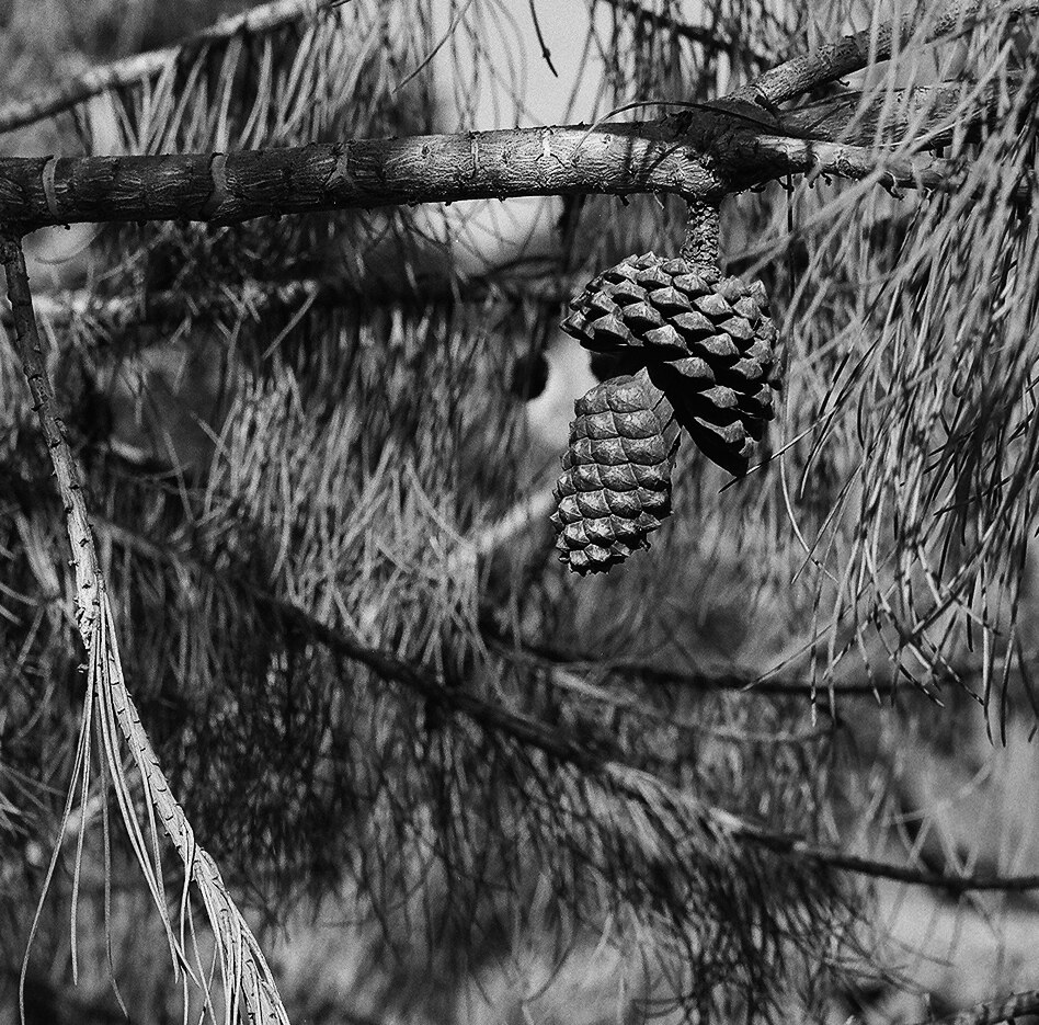
One more thought. The lens is ridiculously sharp, all the way out to the corners. The first roll was Delta 400, which I am beginning to really love. I could have used Delta 100, but I had planned on messing with a red filter and thought the 2 stops would be welcome, but i got too excited and killed the roll before I got around to it.
Most of these are F11 or F16 (no meter with me, so I sunny 16d it) and 1/125 or 1/250. A couple were at F8. Check out the detail on this pinecone, which is cropped from the image posted in the gallery, and realize this is the economy, low resolution scan:
I might have a go at one or two of these negatives with my scanning rig to really see what the resolution is like, but I’m impressed. I think that’s all I have to say. I won’t share the ugly image, but I will show you the rest of the roll. Behold!
And here’s the higher res. Again, these are the cheapie scan, only 2000 pixels total, and they are this sharp.
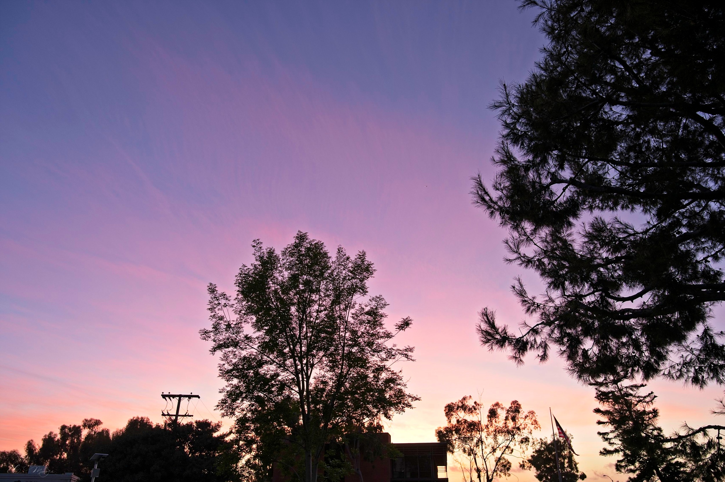
I’ve been shooting different black and/or white film stocks, just so see what’s what. Got a day with perfect clouds, to the east, so I just walked around and did some composition studies while burning film. I wish I’d had the Delta100 or Tmax in, but I hadn’t expected the lovely skies that evening. Had to take advantage of it while it was there, so 400 speed it is.
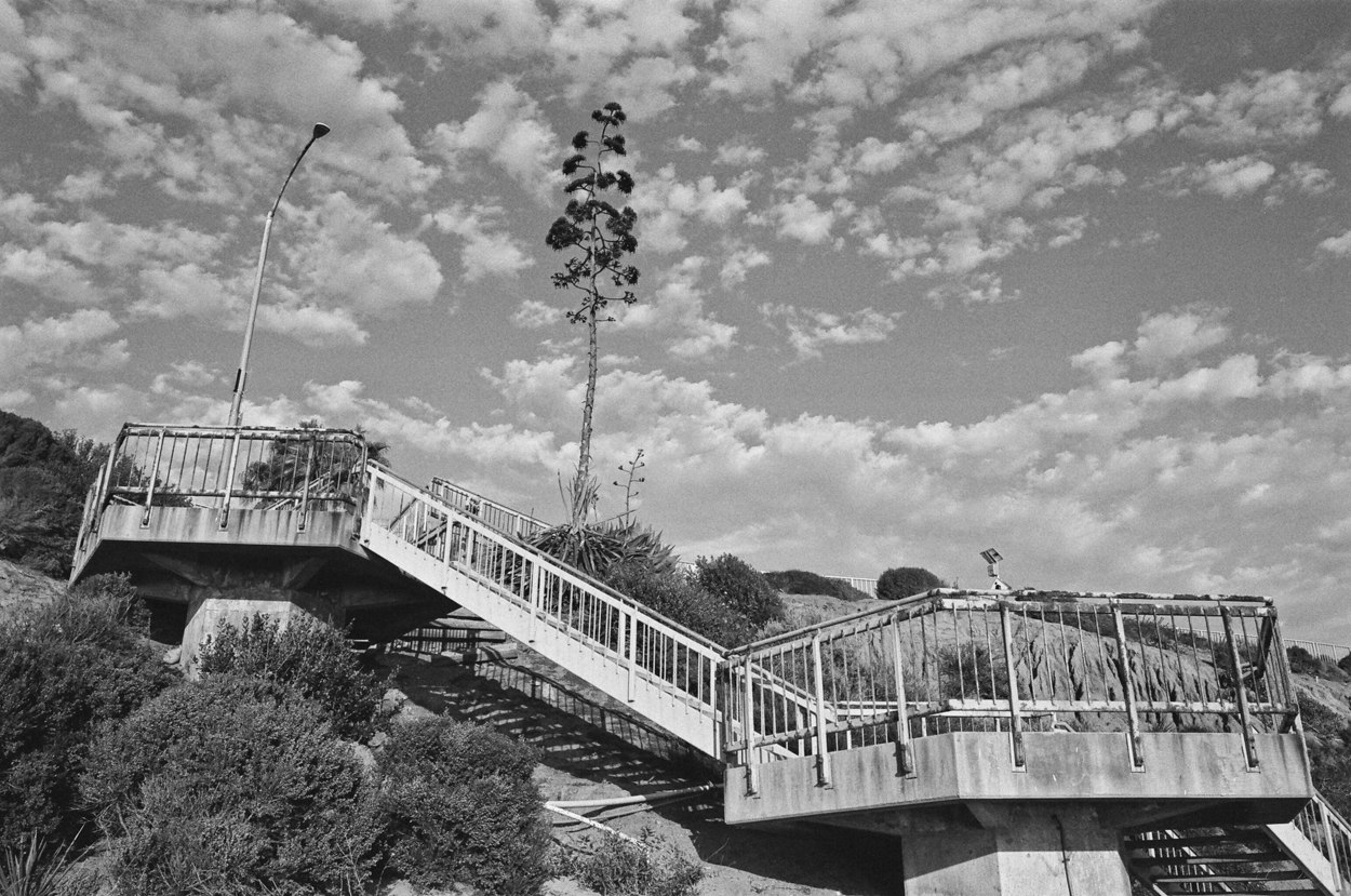
I also think I’d have enjoyed a yellow filter. Something to really pop those clouds, though I have to say that I was surprised at how dark the awning on the liquor store is (blue) and how darkly the green trees were rendered. These aren’t my scans, they’re the bargain scan from my developer. But I like the composition enough on a couple of them I might have at ’em myself, see if I can do a better job.
Black and white has been interesting to me for years, but I haven’t been shooting it much since I started with film again. I’ve used some HP5+, and one roll of Delta 50 that I pretty much universally underexposed, and that’s it for true B&W. I also shot some of the XP2 that you develop in C41, and I like it, but that was 6 months ago. So I grabbed a few rolls each of some film stock that interests me and one of my cameras will be loaded with B&W all the time until I have tried them all.
The stocks I chose were Delta 50, Delta 100, FP4+ 125, and XP2 Super all from Ilford, and Acros from Fuji. Maybe I have an HP5 roll here, too, I would have to look in the refrigerator to see. I also have a bunch of Delta 3200 and XP2 in 120, which was a gift from the man I bought my GX680 from. I’ll try to get to now that I have a third back for the 680s and can keep B&W loaded and still have a back for slides and negatives. I’d really like to convince some people to sit for portraits with the 120, and I learned that Delta is actually native a lot slower than 3200 (800 speed? I’d have to look) so I could probably get some with acceptable grain even doing something stupid like street photography with 10 lbs of medium format camera hanging from my neck. I might haul that around the village and ask people to let me take portraits as a lark. But for now it’s 135.
You might remember the first roll, which was was FP4 in my F6. I posted some samples here a couple weeks back. It’s a usable film, and I even think this one was a genuine winner:
I did the same with the current roll of FP4, just taking shots of random subjects. I was using the F3 this time, which has a center weighted meter instead of a matrix like the F6. I don’t know if I’ve bonded with it yet, though it is a great camera. I definitely underexposed the portrait I shot not realizing it was 80% center weight. I need to remember it’s like the middle setting on the F6 switch when I’m searching for shadows. Maybe narrower, even, as the FM3a is 60% CW. The F3 is almost a spot by comparison.
I got some good shots, and I didn’t always shoot when the light was great because, frankly, I was getting impatient to burn the roll and get it processed. I didn’t bother worrying about the subject matter either, I just wanted to shoot something.
I’ll say this, FP4 is good film. I like it, It’s more contrasty than I expected, and it can be super sharp. I’m really impressed with the details I pulled out, even in tougher light. I will be happy to shoot this in bright light in the future, and I might even do some DR5 processing and make slides.
Here’s a dump of some of the roll. Random subjects. Random lighting. Even a bunch of balloons, one of each color, like I’d planned a test. I got lucky on that one. Behold!
Working with some older manual cameras the last week. Specifically an F3 and an FM3A. The Ektar shots here are from the FM3A, the B&W are Ilford FP4 in the F6. I think the Still I Stand shot is a winner, the rest are mostly trash. Partly because they’re just snapshots as I was excited to try out my new old camera, but also because the scans are kind of terrible.
There are horizontal stripes in the skies of many of the shots, especially the Ektar. I’ve had this issue in the past and it is not on the negatives (or the slides, I’ve had it with Provia, too, and with medium format negatives) and I’m just not sure why it’s happening. At this point I’m convinced the lab’s software is shit, and these are JPEG artifacts, as they are almost exactly what happens when I try to reduce size on a digital shot from the Z6.
The thing is, I don’t get why this happens from the originating scan. Shouldn’t it be like a full sized digital image? Are they reducing it to make it smaller for the download and just overcompressing the jpeg? Whatever it is, they claim they can’t seem to see it at the lab and, frankly, I can’t not see it. They say nobody else has the problem, but I just cannot imagine how that is true! I don’t know if I want to even bring it up again, I’m getting a reputation as the complainer, but I’m to the point where I think I’m going to have to rig a light source for my camera and a macro lens and just scan my own.
Whatever. I’m just really fucking annoyed. Here’s what I came up with. I didn’t bother to pick and choose, this is any of them that aren’t blurry because I can’t focus.
Walking around the Village on a bright, sunny afternoon, burning film just to see how the colors come out. Most of these were taken over the same wonderfully warm weekend, Friday and Sunday. This is all Portra 4001, 135, from the same roll.
My last attempt at Portra I shot +2/3 of a stop, but I accidentally forgot to set the camera to overexpose on Sunday, which I genuinely meant to do as my last experiment with that produced better scans than shooting at box speed. Especially on the more contrasty photos like the Cantina, where I could have used a little reach into those shadows. The picture of Fiesta Liquor taken on Friday is +0.7 and scanned nicely. I could have gotten away with more. The beach shots definitely would have benefited from a little extra, it’s easier and less grainy to pull back a highlight on Portra than to try and recover something in a shadow.
Speaking of… One thing I’m noticing in 135, the grain is a lot more apparent. I’m cool with it on the 6×8 negatives, but these tiny little baby negatives certainly suffer for the higher speed.
1. The B&W photo is from the same roll, I did it in the photo shops just to see how it compared to actual black and white film. I uploaded it by mistake but, what the heck. Might as well share.
Velvia is the standard for landscape photography. Or at least it was when I was taking pictures on film in the ’90s. I seldom used it as much of my photography was out the window of a glider and the combination of low speed and dynamic range made shooting slides a fraught endeavor. But since I’m always on a tripod these days, why not try?
Well, I’ll tell you why not. Medium format is expensive. It’ll cost me $4 a shot for film, develop, and scan, so I practiced with more forgiving negative film stock before I tried the slide film. Velvia is 50 speed, has significantly less exposure latitude than negative film and digital, and is prone to reciprocity failure on longer exposure shots. You have to nail the exposure, and either have a lower contrast scene or be fine with certain shadows going pure black or highlights pure white.
I have two backs for the GX680, so I loaded one with Velvia, the other with Portra 400 (it was in the back already, else I would have shot Ektar as my comparison negative stock) and went to the village for some experiments.
First, here are the scans straight up. Minimal editing makes a better comparison. Note, the liquor store I took from the middle of the street, so I was running into the street, snapping the shot, then scurrying out of the way of the cars, so the unedited scans needed a little rotation and composition hygiene.
And edited comparisons below. Note, these are minimal edits, just a touch of optimization and a little rotation and cropping for the most part on the liquor store. It was a perfect scene for this test being well lit with a variety of interesting colors, and shows how much warmer Portra is, as well as how much the blues and greens pop on Velvia. The Village Kitchen and Pie Shoppe with extra Ps and Es to make it fancy I chose for the opposite reason, the light was washed out and there were some shadows and bright clouds so I could see the dynamic range. This isn’t the raw scan, I pulled the sky back about 1/4 to 1/3 of a stop in editing to see what there was to be found in those highlights, and it has a little dynamic contrast boost, too. You can see the sky is blown out on the Velvia in the lower right corner where there’s detail to be pulled out on the Portra.
I don’t have any direct comparisons from later in the day. Instead I was just trying much more challenging shots. The clouds turned a crazy pink and red after the sun set and, though I understand that Velvia is not a high contrast film, I tried some high contrast shots. The blacks are black. I mean, there’s NOTHING to be pulled up there. But I was shooting for the sky and the highlights, so I expected that. These long exposure shots really show the weirdness of Velvia. The sky was blue and pink, and it did hint toward purple, though the Velvia just made everything… extra. A digital shot of the same scene is below to compare to the Velvia version.
I am also including a few other shots I got back. The sunsets and pictures of the Village are from a roll of Ektar I ran through the F6. I am shooting most everything up 2/3 of a stop and the scans seem to come back better. I’m also pretty darned happy with the sunset scenes, considering how contrasty the exposures are. You can definitely see the grain with the tiny little baby negatives, but it’s not distracting in these shots.
The train was with the GX680. I’d lost the light so the bush wasn’t as bright as it had been, but I like the composition. I converted it to black and white because, if I like B&W, then the composition feels good to me. The last image is a from the same roll of Portra 400, and I liked it so I thought I might as well share.
So… Velvia. It’s something. I’ll have to shoot more of it, maybe find some other fun colors. And if in town, I should bring the 100mm or 135mm so I don’t have to stand in the street to take a picture. I love that 50mm lens for landscapes, the view is expansive, but it’s about the equivalent of a 22mm lens on digital as far as field of view. I could definitely use more reach for a walking around lens.
Not much to say. These are only posted to share with a friend.
For context, I have a wild hair to get a good shot of the train on film. Tested it with digital to see if I liked the angle, but the light died on me before I got anything really good that day. The awkward angle on the shots across the water from the bushes were because I literally just spun the camera around on the tripod, which was at my knees, and took a few shots while waiting for the northbound train to arrive. That one wasn’t a winner, so I didn’t get the good film shot either as the clouds had blocked the golden hour by the time it arrived. I’ll have to try again.
I’ll get a good shot one day. Takes a little planning, though, as it necessitates hauling 30 pounds of camera gear and tripods a half mile to get to that spot.
The second sunset was this afternoon. The wind was blowing so no reflections, but it was a lovely evening to be outside and watch the clouds change color, so I’ve got that going for me, which is nice.
I have been burning through some film stock, trying to see what’s what in negative film. The recent tests have been on Portra 160, Ektar, and PanF 50.
I originally thought to just try one black and white and one color film, and chose Ektar and Ilford XP2 to start with. The Ilford was chosen at random as a 400 speed black and white that has been around forever, so I figured it was a standard. The Ektar because I saw some great landscape images on the website of a photographer I like1. Both are reputed to be forgiving, so I got a box of each.
But I ended up with a large variety before I even shot my first frame. The gentleman I bought the camera from said he’d toss in a “couple rolls of film to get me started,” which I thought was awesome. But his definition of “couple” was quite expansive. He actually gave me a two boxes of Portra 160 as well as a bunch of Ilford black and white including PanF 50, Delta 100, and Delta 3200. Quite a variety!
Ektar is supposedly the more saturated negative film, and I’d thought to do some saturated landscapes when I decided to try film. The first rolls I shot that came out showed that it is, in fact, super saturated. Enough that skin tones get a little ruddy and golden sunlight gets a touch of red in it. The roll I got back today, however, was shot into a sunset with wild colors reflecting on calm water and it was beautiful.
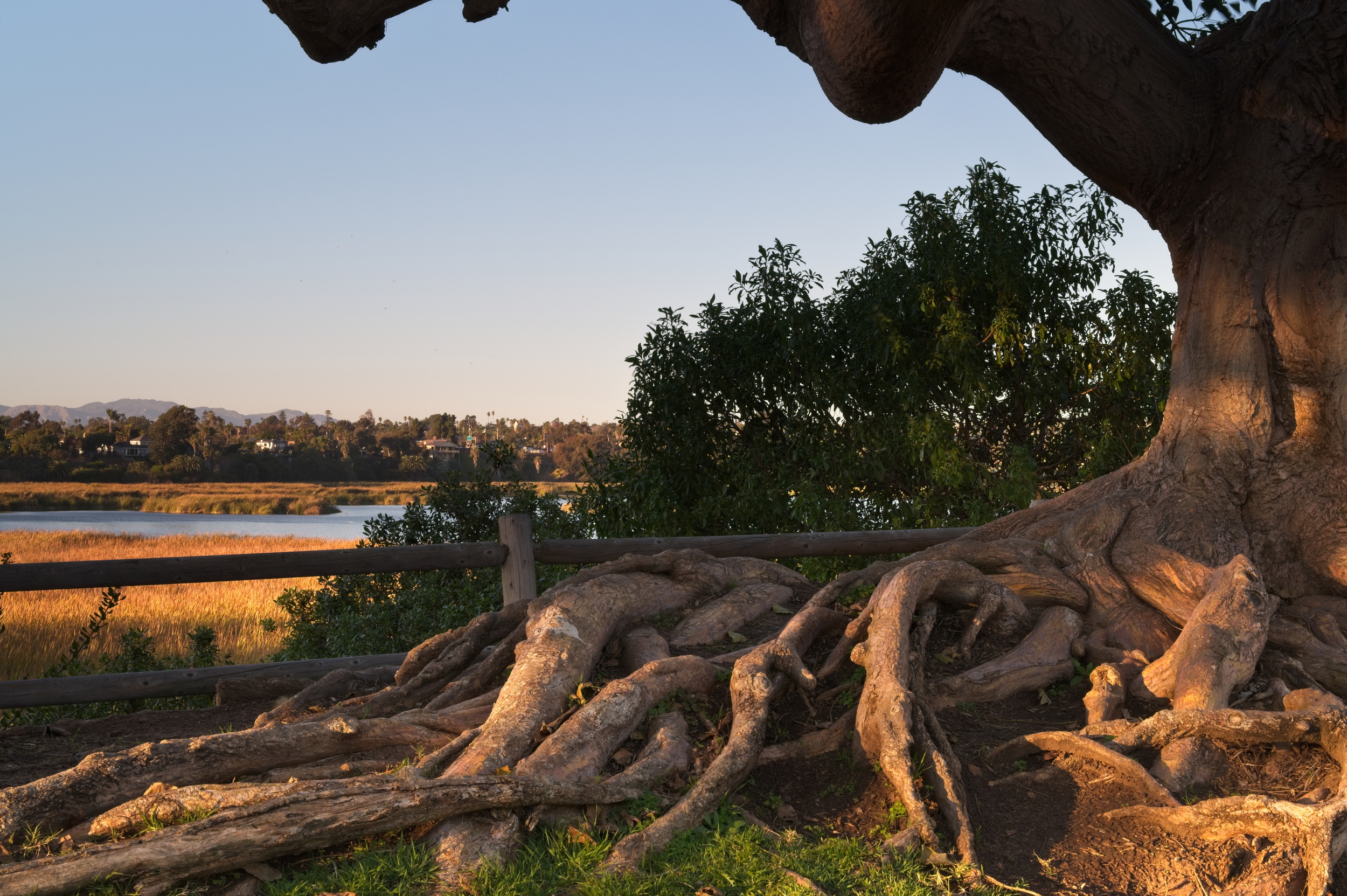
This shot was the last frame of Ektar I had — I took three shots, the other two as lovely but I like the ducks in this one. I shot Portra before this for comparison, and was about ready to pack up and head back to the truck, but this was a sunset that never wanted to give up and a few minutes after I ran out of Ektar every cloud lit up an amazing pink, and even the ones overhead were reflected on the still water in front of me, so I slapped on the back with Portra 160 and gave it a go.
In all cases I knew the reeds in the middle were going to go black. The sky and the water only had a stop or two difference, but the reeds were several stops down, so I metered for the water and let the sky take care of itself. From what I’ve sussed about these films, you can go down a stop or two then it gets noisy, then black. You can go up way more and the highlights won’t run out of information even if they’re four stops over.
Well, the Portra definitely fits that bill. It’s amazeballs, and even the reeds in the foreground, which are down two stops, show the weird pink glow everything had in real life. The second shot is a four or eight second exposure3 and I can’t tell you how happy I am it came out like this.
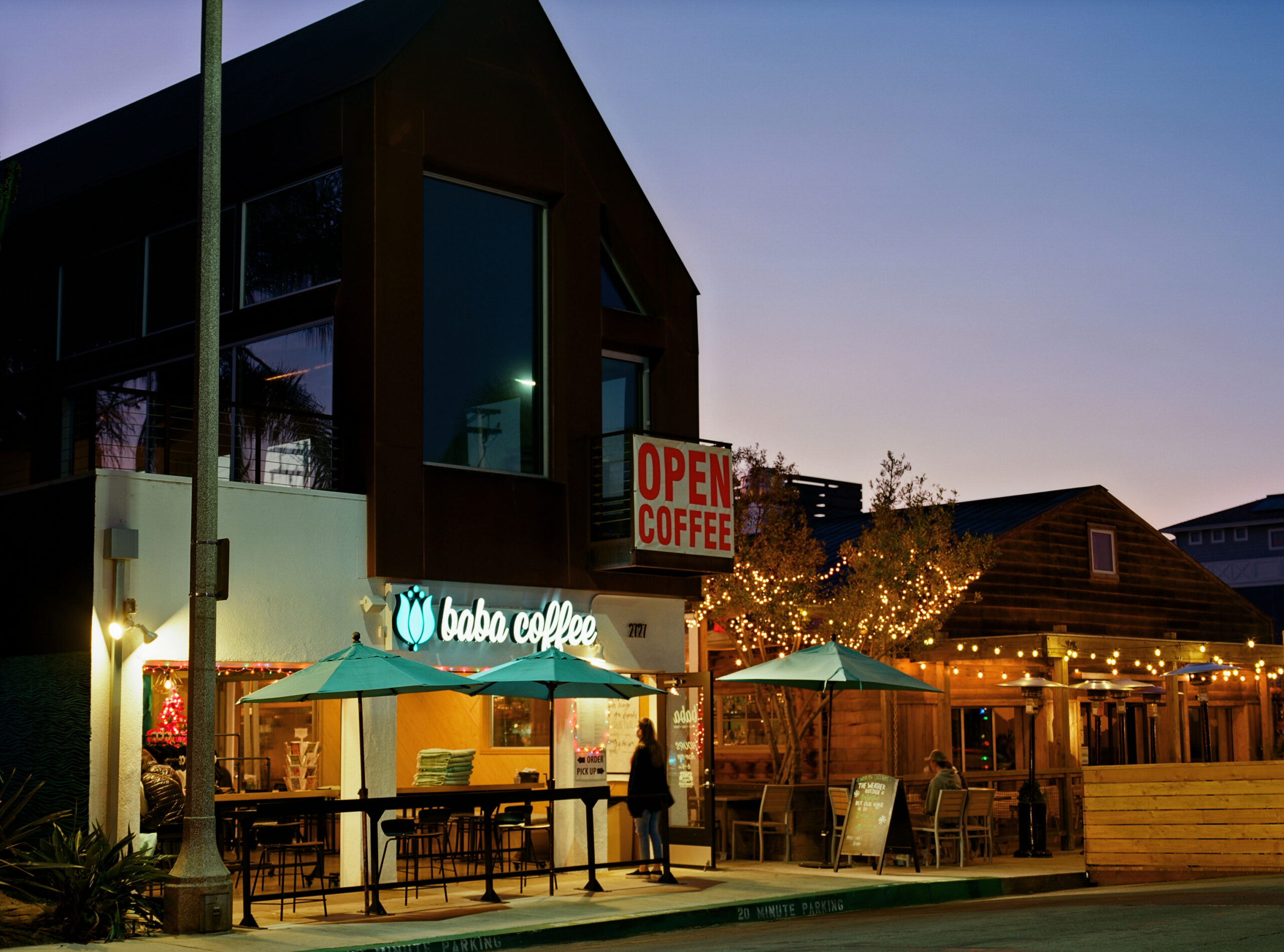
Another roll of Portra had some night shots I’d done the week after Thanksgiving, including shots of Baba. The less saturated colors are even more pleasing than the slightly over-the-top Ektar shot of the same scene, and the dynamic range is beyond impressive.
Baba Coffee — shot on Portra 160Baba Coffee — shot on Ektar 100
The same shot in Ektar is also lovely, but I’m a fan of the Portra. The colors are spot on, and the dynamic range is even better than the Ektar, which already handles the lit sign better than digital by far. Note how much more influence the streetlamp has on the color cast on Ektar as well, coming up a little green, but also note how much extra blue it adds to the sign and the umbrellas.
Even though I metered the same way, the Portra shot might be slightly more exposed. It is 160 speed film, compared to Ektar’s 100 speed, and having come only a few minutes later in the evening I’m guessing it wasn’t a whole stop darker even though I corrected up a full stop, but the highlights are still beautifully handled. The information in the dark areas is lovely, too, and you can tell the building above is a deep ruddy brown.
As for the PanF 50, I don’t know what to make of it. Every single image I took the camera barked at me4, even when I thought I was doubling the meter reading. I’ve learned two things here, first that PanF has a lot of reciprocity failure and needs quite a bit more than the meter says, and second, that the Fuji really doesn’t measure well at ASA50 so sometimes you just have to let it beep at you and tell it to suck your balls. Both of these shots were called underexposed and, though not exactly perfect, were not so dark I’d expect them to be more than two stops down.
I also took some experimental artsy5 shots of some bridge pilings where I had deep shadows and brightly lit concrete. All three had the camera beeping and flashing lights like a pissed off R2D2, yet I’m not convinced that they are too dark. The darkest one is underexposed, sure. But at very least least the brightest one has to be within two stops of adequate, regardless of the disapproving minus sign.
That said, I printed out a reciprocity chart for Ilford films and tossed a copy in each of my camera and gear bags. 50 speed film is slow even in full daylight, and the failure on these black and whites is way more than I realized. 4 seconds on the meter translates to over 7 seconds in the real world, and it gets worse from there so this stuff isn’t just meter for the shadows. It’s meter for the shadows then double it.
This was a fun bunch of data. Not in the least because I am still very uncertain about how to meter for a lot of situations and having a few frames come back nice, not just recoverable, is quite a relief.
The next batch will be both better and worse. I tried some crazy long exposures, which I’m almost certain won’t be good but will give me data on how far off my assumptions are. And I shot some tonight that included a spectacular sky and some pretty reasonable subjects, so I’m confident the incident metering in conjunction with Portra’s dynamic range should give me a usable shot or two.
1. alexburkephoto.com — I don’t know the cat, he just posts beautiful landscapes and explains things like metering and filters in a way that I find very easy to understand.
2. After carefully exposing several shots, bracketing the meter, and recording my settings for test purposes, I pulled this roll out of the camera and dropped it, at which point it sprung open and ruined the whole roll. I now keep a rubber band in my pocket to put on exposed film and keep it from unrolling, just in case.
3. It was very dark and I had put my notepad away already, so I don’t remember exactly. Which is foolish, as the whole reason for this was to test film and practice exposure in challenging conditions.
4. Being state of the art in 1997, this camera does metering through the lens. But only while you’re taking the picture, not before hand. If it doesn’t think it got enough light, or got too much light, during your exposure it will beep annoyingly and flash all the LCD screens in a fit of disapproval. Strangely, it makes it extra satisfying when it doesn’t beep and the “EXP” is shown on the screen instead of the flashing lights and a + or – sign showing that you over or underexposed that last shot.
5. This just means they’re crap shots. But if you act like they’re great art filled with hidden meaning and anyone who doesn’t understand them just doesn’t get it, maybe you’re avant-garde.
I got some rolls back from the developer today. I had tried a few things in black and white using Ilford Delta 100 and Ilford XP2. I also did two rolls of color, Ektar 100 and Portra 160, to compare them. But, alas, I pulled the roll of Portra 160 out in the field to swap in a new roll and the worst confluence of events happened.
120, I have learned1, is not a cartrdige film like 135. It comes on a plastic spool and you wind it up on a second plastic spool. When you are done the second plastic spool holds the film and you just swap the spool that came with the last roll into the takeup spot for the next roll of film. Normally, the exposed 120 film gets sort of sealed closed when the roll is finished up. There is an adhesive leader that is just enough to keep it on the reel and tight. But this roll of Portra didn’t seal up for some reason and, of all the times to be clumsy, I chose THIS roll to drop. I watched it spring open and wipe out all the carefully exposed images I’d taken the previous week. Dammit. At least I got some shots from Ektar roll to look at.
Delta 100 is pretty much a standard, fine grain, decent contrast, forgiving range. I was given two rolls by the gentleman who sold me the camera and since they had the closest expiration date I started there. I am very pleased with what I got out of them and will certainly use this film again.
The XP2 is weird. It’s a 400 speed film and, though it’s black and white, it is processed with C-41 like color film. I was looking for a 400 speed when I bought it, and didn’t realize it was weird like that. I guess that is a benefit in some places, as it can be developed by any lab, but the folks I’m using charge the same for B&W as color, so really quality is quality. Grain is different than Delta 100, but it is supposed to be contrasty and saturated and still has good latitude.
The Ektar 100 makes very saturated, colorful images for a negative film. It still has more latitude than something like Velvia, where you’ll blow highlights completely more than a couple stops over, so I thought I’d try it for landscapes and sunsets. I’ve had mixed results there, but at least some success with my most recent roll. And I have learned that they aren’t kidding when they say saturated. It pops color and paints skin a bit red.
The Portra 160 is supposed to be fine grained and have much more honest colors. Good for portraits and skin tones, etc. Like I’d know. The first roll I shot I threw on the ground. I’ll have to report back after the next roll is done. Maybe I can convince Doug to stand in the sun again so I can get a portrait to compare as well.
I started with Delta. You remember my first film picture from the earlier post:
Very pleased with the qualities of even my marginal first attempts, I loaded a second roll and took some portraits of Doug and Bootsie. Then I spent a little time wandering the village on Tuesday night when it was reasonably barren so I could get some more difficult subjects.
Here are the portraits:
Nothing wrong with those other than my marginal skills at focusing. Plenty of detail in the shadows, excellent grain. Easy peasy. Here are the night shots, which tested the film much more, mostly because I was having trouble deciding how to meter in the dark2.
For Spin Record, I chose to meter the Spin sign as medium grey. It’s a yellow lettering on a brick wall, and that wall is way darker than medium grey. Probably should have gone at least one stop down, maybe two even, so I could get more detail inside the store and not blow out the Open sign. But it did hold a lot of detail in those highlights, even 4 stops over.
The Baba shot was better metered. I shot everything and decided it was all within a reasonable range, so I just metered to the tree leaves above the lights in the upper right. I got plenty of detail everywhere.
The spin photo, not so good. But I know how to do it better. The Baba photo, however, is stellar. Even in the dark where there’s no blue hour sky to make that corner interesting, I really like this photo. Especially the We’re Open sign, which gives it a very Clerks vibe.
For the XP2, I shot some at the lagoon. Most of the shots are of well lit reeds, which are beautiful in person but kind of boring as a photograph. The contrast is good, detail is good, grain is just fine for 400 speed. I did try a hard one, just to see the dynamic range, taking pictures through a shaded tree of an extremely bright background. It was able to handle four stops without too much trouble.
The sky isn’t blown out. It was just ridiculously clear that day. Like you could see forever clear.
I also shot these with Ektar (And with portra, which I then ruined) and was surprised at how much range Ektar had. Also with how ridiculously saturated it is.
For reference, those reeds are golden. Here are digital images from that day that are closer to the real color of the lagoon. The one through the tree is HDR and kind of sucks… I don’t like HDR. But it is presented here as a comparison so you can see how much Ektar pops the reds and greens.
Portraits of Doug and the dog definitely show how extremely saturated Ektar comes out.
The greens are rich and lush, and the colors of his shirt and vest really come through, but his skin is a bit ruddier than in real life. Good to know for future film choices.
I took a shot of Baba two nights ago. This was one week after the black and white one above, and taken during the blue hour as they were preparing to close up.
I took a digital shot about fifteen minutes later, and the Ektar is as saturated as the processed digital, but also has nicer highlights.
I have no idea what I did to get the color shift in the sign. I have auto white balance going on, so most these colors are probably more real to life, but I had to dial back the highlights in the digital image quite a bit to get those lamps in gamut and doing so maybe I pulled some of the blue out. It is a wonderful image, full of detail, that I’m very proud of, but the highlight range on that film is really cool. Even with the green tint from the streetlamp and the exaggerated reds, I dig it. The lamps in the restaurant just pop, and yet nothing is blown out on the sign or the white wall. The more I look at the film image the more I like it, so I intend to mat it and give it to the owners of the shop.3
1. Really, I just learned this two weeks ago. Don’t take my word on anything film related. It takes at least three or four weeks to become an expert on things like this.
2. This is mostly hubris. A wise man would shoot a few rolls in the daylight of a simple subject that could be metered by holding the Seikonic in the air and doing whatever it said. Dealing with new gear, in the dark, and trying to spot meter was too much to do at my skill level.
3. Again, hubris. But I don’t have a place for tons of prints so I pretend people care and give them away. Most people act like it’s a big deal, and I don’t have to watch when they toss it in a drawer and never look at it again so my heart still swells with pride.
Or… How I lost my mind and decided to do things in a way that’s harder, slower, and takes significantly more effort for modest results.1
So, yeah. I bought a film camera. Not too bad a thing, right? Considering I have a metric crapload2 of extremely high quality Nikon lenses that will work extremely well on an old body I could either dig up my old FM or just snag an N90 off the fleabay for $40, scrape all the gooey rubber stuff off, and be good to go. I could even splurge a little and get an old F, which is one of the cameras I learned on. My middle school art teacher had an F photomic he’d let me use, though the classroom camera I used most was a Pentax K series, which also holds a place in my heart. But that giant silly pentaprism on the F photomics strikes me as one of the Japanesest looking things in 1970s photography and I love it to this day.
Even an F4 would be a relative bargain, and would scratch the nostalgia itch because it was the camera I wanted back in the days I was shooting regularly with my FM and 4004. In fact, the F4 is about as modern as I would need at a fraction of an F6 price, and would pair beautifully with several of my lenses. Even an F5 is less than half the price of a used F6 and might be the best built camera Nikon ever made. So many great 35mm options.
Definitely the wise choice for me would be an F4 or F5 to use modern lens features, or an older F series if I don’t mind manual focus (which I don’t). Small investment, big reward there.
In case you’re not getting the hint, this camera is big. It’s like a Flintstones camera, everything strangely oversized and extremely mechanical compared to modern digital
Having carefully thought through the best course of action, definitely being a late model Nikon, I bought a medium format camera. And not an old RB67, an absolutely ridiculous Fuji GX680IIIs. 6×8 negatives, switchable and rotatable film backs (to shoot portrait without having to move the camera), autowind, hot shoe, and all of the other bells and whistles that were absolutely state of the art for medium format in the mid ’90s. A far different ecosystem than the 35mm I grew up in, and of course completely incompatible with everything else I use — including my filters, alas. More on that later.
A local man was selling a very complete kit with a pair of film backs, half a dozen lenses, and various other accoutrements, all in reasonable working order and good for local pickup. I could theoretically get shooting right away and not have to further accoutre this beast. So I struck the deal and we made arrangements for me to pick it up last weekend.
When I got there it was even better than he promised. He made sure everything had batteries (the film backs have separate batteries from the body, so they will hold their meta information when separated) and all was in good working order, and had more accessories than I expected or really think I’ll use, including a Polaroid back, extended rails for macro work, and the remote, which I really like for zero shake shutter release on landscapes. He was even kind enough to throw in a bunch of fresh Ilford Delta and Portra160, to which I added a box of Ektar100 because I have read is very saturated which might make for interesting landscapes.
He also supplied me with a substantial tripod at a reasonable price, something I had not yet located, but decided I needed before even paying for the camera. My Manfrotto’s legs are up to the task but the ballhead is pressed to its limits with the the 200-500 lens, ftz, and Z6, all of which add up to about 8lbs. In Manfrotto’s defense, the only time I really have problems is with the lens fully extended and at angles, like when shooting the moon, which really unbalances things. Still, I didn’t want to push it with the Fuji. The Bogen I bought from this kind gentleman has a video head on it that’s rock solid. Probably too much, in fact, as the tripod weighs as much as the camera. But, again, it is safe and usable. I can find a slightly more portable solution later. For now, I will just stay near enough to the car that I don’t mind the 12 pounds of tripod.
In case you’re not getting the hint, this camera is big. It’s like a Flintstones camera, everything strangely oversized and extremely mechanical compared to modern digital, or even 35mm of the same era. I got the S version, which is the “lightweight” jobber without tilt and rise controls on the lens, so mine’s only 8.5lbs with a smaller lens. The III (non-S) is half a pound heavier, though it has rise and tilt controls you only see on large format. If I was shooting architectural I might have held out for a bargain on that version out of Japan, but my original idea for medium format revolved around landscape and portraiture, where this should shine.
When I mention mechanical, I mean in the sense of 1990s Japanese industrial design, where everything is remarkably solid. The film motors sound resolute and powerful as they wind. The mirror raises with a resounding thunk and even the shutter itself — leaf shutters that are made by Seiko and built into the lenses — is loud. So loud I would never use this camera for wildlife. At least not up close wildlife that I was not wanting to disturb. But it’s not an old fashioned, all manual camera. It was pretty state of the art in terms of 1990s medium format, in fact.
Of course, there’s no internal metering like on a modern 35mm. Actually, that’s not true, there is internal metering, but only while the exposure is happening so the thing will beep angrily at you after the shot if you are over or underexposed by 2 stops.3 But otherwise you get to pull out the Seikonic and deal with that hideous UI to figure out what exposure settings you need.
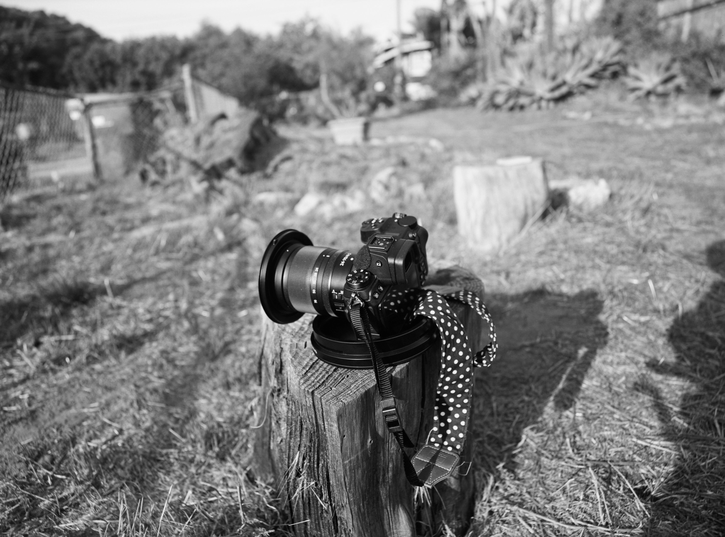
So, my first image, taken in lovely black and white to make it super artsy-fartsy awesome, was of my tiny little baby camera.
The aspect ratio is 4:3, with the negatives being 6×8. For perspective my cellphone camera is 6.5cm wide, so the negative is almost as wide as the phone screen. In the photo above you see what looks like the end cap of a 5″ artillery shell that the camera is sitting in. That’s the lens cap for the 50mm. It must weigh almost a pound by itself.
The 50mm lens, which takes beautiful photos and has a field of view slightly wider than my 24mm on the z6, is just monstrous.4 Alas, it has 112mm filter threads, which means I can’t use the 100mm filter holder I use with the z6 as most of my Fuji lenses are 95mm or 112mm threads.
Most of the black and white roll I shot that day came out OK, but I underexposed most of the color roll. A combination of having trouble setting and reading my light meter — which I think I have since beaten into submission — and thinking digitally. I can pull detail up from too dark in digital, but with both Ektar (color) and this Ilford Delta black and white film it seems best to use the old-school method of metering the shadows and letting the highlights take care of themselves.
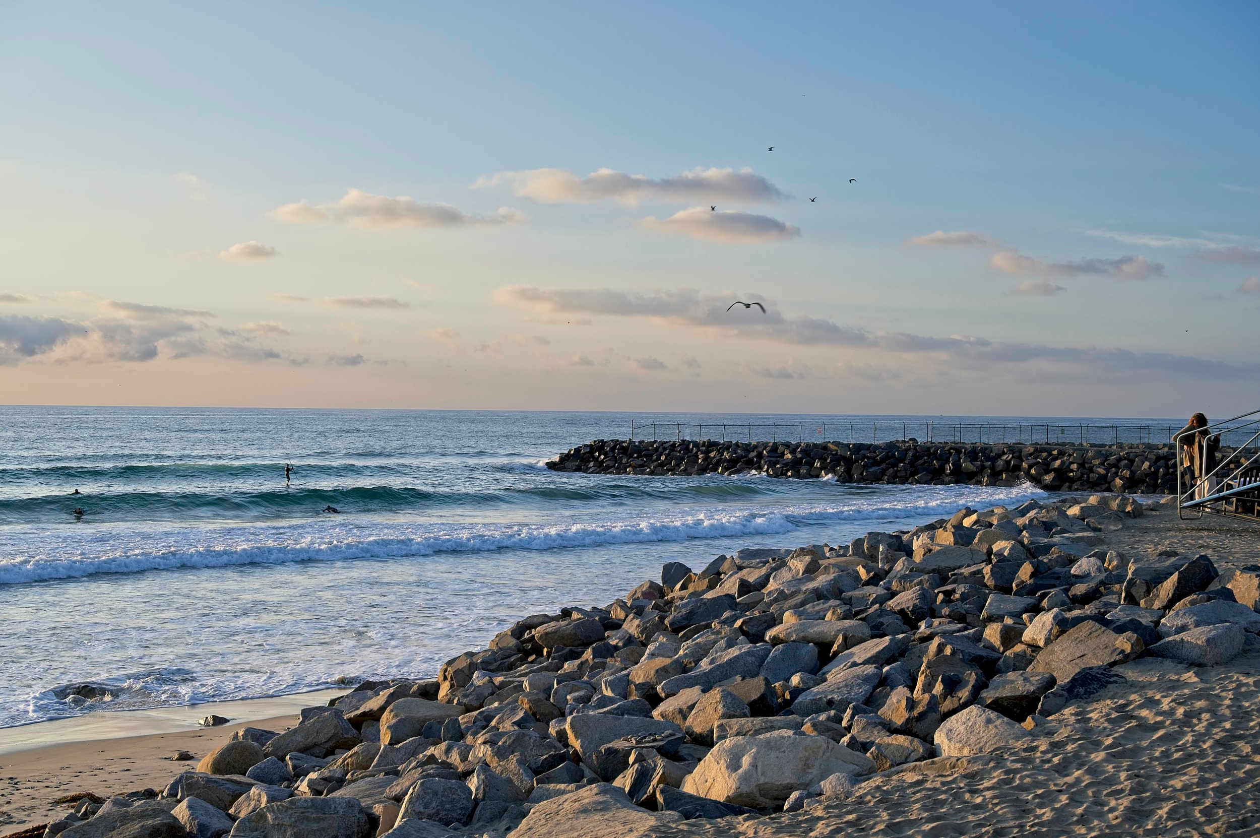
The first color photo I took, underxposed, was of the Z6 and the powerplant below. The light was wishy washy at that moment and I should have just blown the sky out. The second shot of surfers and rocks was also underexposed, and I could easily have added a stop to get detail from the jetty, which was positively glowing in real life, and still had plenty of detail in the sky. For contrast, I added some that I took properly exposed of Doug and that little asshole dog. Between the underexposed early attempts, and the mundane pose (poor Doug had no warning, hadn’t shaven or dressed or put on his best ball cap, but I was in need of a subject) these don’t qualify as artsy. Doug calls the dog “Stinky” instead of his given name “Bootsie” so I’m thinking they qualify as fartsy, though.
On the surfer picture, I shot the rocks with a spot meter to make sure I didn’t blow the highlights and it came up a stop below the incident reading and what the Nikon was saying, the sky and reflections spot metered a couple stops above. I fudged down, as I would with digital, and it was all too dark. Too dark also means more grain, and less detail with Ektar. I am having to learn what is a good match for medium grey and those rocks are way lighter. Frankly, I shouldn’t bother with the spot at all if I’m not stretching more than five stops. The sun lighting me is the same distance away from the rocks and the surfers, I can just trust the incident. But I learn by doing so matching anything I can point the meter at with the incident reading should, in theory, eventually teach me what is a midtone and what isn’t.
For the portraits I just believed the incident meter and, for fun, shot all kinds of stuff in the scene with the spot. The green plants are a good substitute for middle grey, and the browns come up close. The shadow of Doug’s face under his hat was within a stop or two of those readings, too and the film had plenty of dynamic range to handle it and not lose detail.
And it looks pretty good when actually, you know, properly exposed. Ektar really does have saturated colors for a negative film, all you have to do is get enough light on it. Who would have guessed it?
For reference, here’s the surf scene properly exposed.
Properly exposed — taken with the Z6 at the same time as the film shot above
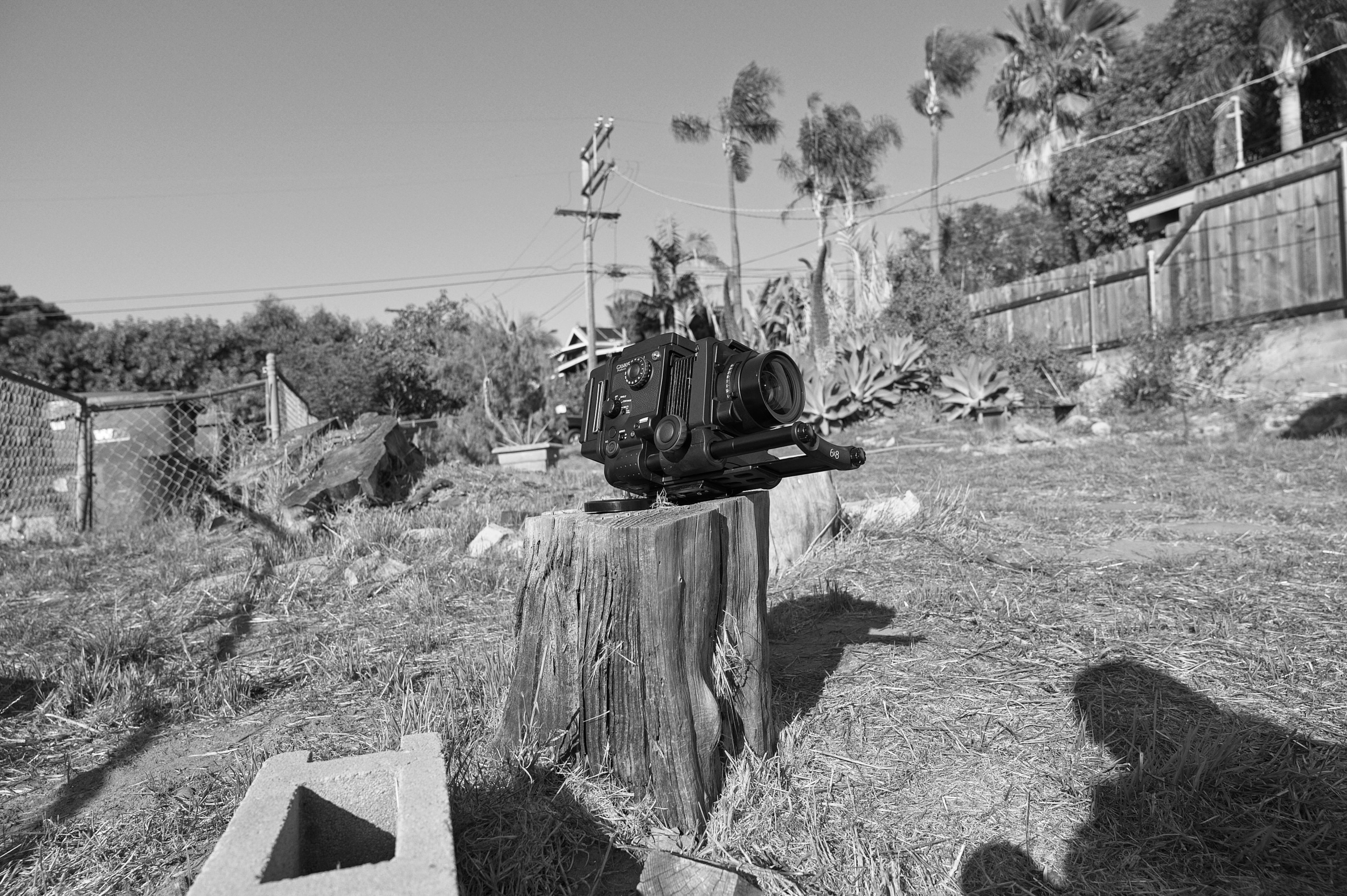
As a silly art project I recreated the first film shot, except in reverse. Using the Fuji as the subject and shooting with the Z6. It’s wearing the 100mm, which is the physically smallest lens in the whole kit, and sitting on the lens cap from the Nikon 24-70 I’m using to take the images. The size difference is palpable.
I’ll post more later about the camera, and maybe some more pictures if I can get any good ones. It takes a long time to get good images with this thing. In terms of setting up, I guess, but especially in terms of the number of days between taking a shot and actually being able to see the results. And if you drop a roll you just pulled out of the camera and it springs open you lose all the shots you carefully composed over the last two days and have to try again.5 But I plan on a roll of film (9 shots) per week minimum until I learn how not to ruin 8 shots per roll. We’ll see if my artsy to fartsy ratio improves in 2021.
1. This should be read in your best Jay Ward voice.
2. Variously Crappeloade or Imperial crapload equal to 1.1023 of a normal crapload
3. I’ve worked with people like that. They won’t give you help up front. Just have you do all the work then tell you you’re wrong after. Those are the best kinds of bosses!