Shooting with the Nikon S3 using the stock 5cm lens. I’ll update the post with other films as I get them developed.
Lab scanned, I only cropped, otherwise whatever the software decided.
Portra 400:
For comparison, Portra 400 with the F6. Lab scan again, but not the same day or the same scanner operator so… whatever the Noritsu shits out. For a bunch of that I was looking at leading lines while on my afternoon walk, so not great art. Just composition studies.
Shot some Portra 400 in the afternoon light. Clouds, then sun, then clouds… definitely spring weather in Carlsbad. No great art here, but I have been jonesing to try new things, including messing with different focal lengths and using the tilt/shift on my camera. At 400 speed I was using too high an F-stop to really emphasize the effect here, but the Velvia shots of the bass and the Neville have the grass a touch more out of focus while the strings stay in sharp focus.
So, these are nothing special, thought I really enjoy how inconsequential the grain is on the 6x8s after shooting the Fuji consumer 400 on 135 last week. That shit’s just plain fuzzy! I never bothered to share, they’re trash shots, but now I know why that film’s so cheap. But I digress. For now, these are here so I can share them with friends. Behold!
Walking around the Village on a bright, sunny afternoon, burning film just to see how the colors come out. Most of these were taken over the same wonderfully warm weekend, Friday and Sunday. This is all Portra 4001, 135, from the same roll.
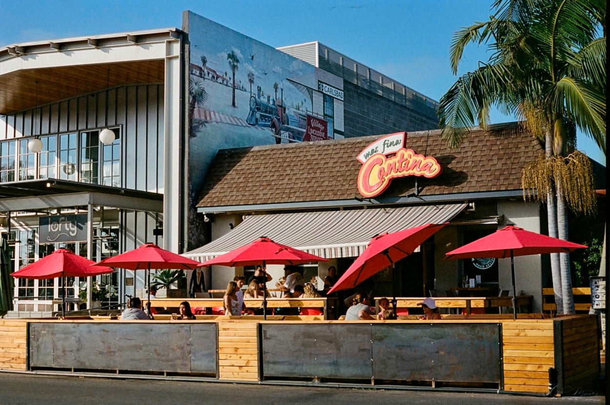
My last attempt at Portra I shot +2/3 of a stop, but I accidentally forgot to set the camera to overexpose on Sunday, which I genuinely meant to do as my last experiment with that produced better scans than shooting at box speed. Especially on the more contrasty photos like the Cantina, where I could have used a little reach into those shadows. The picture of Fiesta Liquor taken on Friday is +0.7 and scanned nicely. I could have gotten away with more. The beach shots definitely would have benefited from a little extra, it’s easier and less grainy to pull back a highlight on Portra than to try and recover something in a shadow.
Speaking of… One thing I’m noticing in 135, the grain is a lot more apparent. I’m cool with it on the 6×8 negatives, but these tiny little baby negatives certainly suffer for the higher speed.
1. The B&W photo is from the same roll, I did it in the photo shops just to see how it compared to actual black and white film. I uploaded it by mistake but, what the heck. Might as well share.
Velvia is the standard for landscape photography. Or at least it was when I was taking pictures on film in the ’90s. I seldom used it as much of my photography was out the window of a glider and the combination of low speed and dynamic range made shooting slides a fraught endeavor. But since I’m always on a tripod these days, why not try?
Well, I’ll tell you why not. Medium format is expensive. It’ll cost me $4 a shot for film, develop, and scan, so I practiced with more forgiving negative film stock before I tried the slide film. Velvia is 50 speed, has significantly less exposure latitude than negative film and digital, and is prone to reciprocity failure on longer exposure shots. You have to nail the exposure, and either have a lower contrast scene or be fine with certain shadows going pure black or highlights pure white.
I have two backs for the GX680, so I loaded one with Velvia, the other with Portra 400 (it was in the back already, else I would have shot Ektar as my comparison negative stock) and went to the village for some experiments.
First, here are the scans straight up. Minimal editing makes a better comparison. Note, the liquor store I took from the middle of the street, so I was running into the street, snapping the shot, then scurrying out of the way of the cars, so the unedited scans needed a little rotation and composition hygiene.
And edited comparisons below. Note, these are minimal edits, just a touch of optimization and a little rotation and cropping for the most part on the liquor store. It was a perfect scene for this test being well lit with a variety of interesting colors, and shows how much warmer Portra is, as well as how much the blues and greens pop on Velvia. The Village Kitchen and Pie Shoppe with extra Ps and Es to make it fancy I chose for the opposite reason, the light was washed out and there were some shadows and bright clouds so I could see the dynamic range. This isn’t the raw scan, I pulled the sky back about 1/4 to 1/3 of a stop in editing to see what there was to be found in those highlights, and it has a little dynamic contrast boost, too. You can see the sky is blown out on the Velvia in the lower right corner where there’s detail to be pulled out on the Portra.
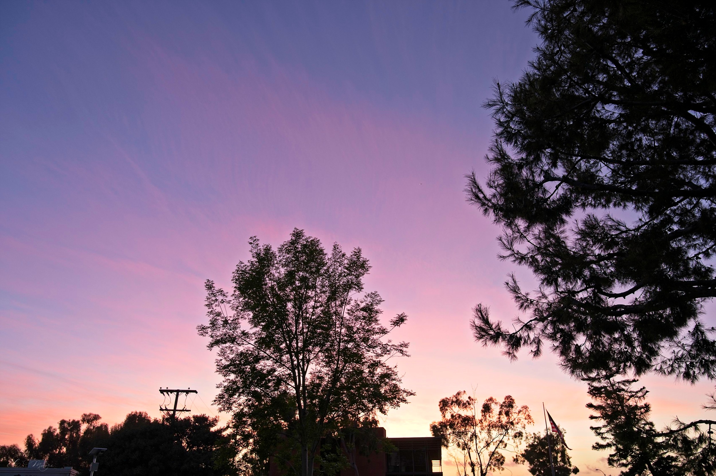
I don’t have any direct comparisons from later in the day. Instead I was just trying much more challenging shots. The clouds turned a crazy pink and red after the sun set and, though I understand that Velvia is not a high contrast film, I tried some high contrast shots. The blacks are black. I mean, there’s NOTHING to be pulled up there. But I was shooting for the sky and the highlights, so I expected that. These long exposure shots really show the weirdness of Velvia. The sky was blue and pink, and it did hint toward purple, though the Velvia just made everything… extra. A digital shot of the same scene is below to compare to the Velvia version.
I am also including a few other shots I got back. The sunsets and pictures of the Village are from a roll of Ektar I ran through the F6. I am shooting most everything up 2/3 of a stop and the scans seem to come back better. I’m also pretty darned happy with the sunset scenes, considering how contrasty the exposures are. You can definitely see the grain with the tiny little baby negatives, but it’s not distracting in these shots.
The train was with the GX680. I’d lost the light so the bush wasn’t as bright as it had been, but I like the composition. I converted it to black and white because, if I like B&W, then the composition feels good to me. The last image is a from the same roll of Portra 400, and I liked it so I thought I might as well share.
So… Velvia. It’s something. I’ll have to shoot more of it, maybe find some other fun colors. And if in town, I should bring the 100mm or 135mm so I don’t have to stand in the street to take a picture. I love that 50mm lens for landscapes, the view is expansive, but it’s about the equivalent of a 22mm lens on digital as far as field of view. I could definitely use more reach for a walking around lens.